 |
| Hosted by Maria (A Night's Dream of Books) and Vonnie (Vonnie's Reading Corner). |
Today's challenge is to post book covers that you love and hate, explaining why.
Here are the covers I love:
 |
| Review |
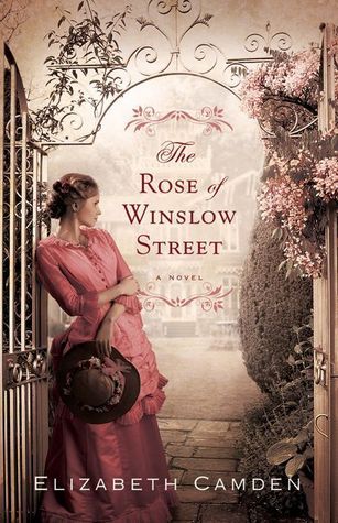
This is one of my favorite covers, if not my absolute favorite. I love every thing about it (the colors, the flowers, the dress, that it matches the story). Not only is the front beautiful, but the back cover is gorgeous with items from the book on it and that makes it even more wonderful after you read it.
 |
| Review |
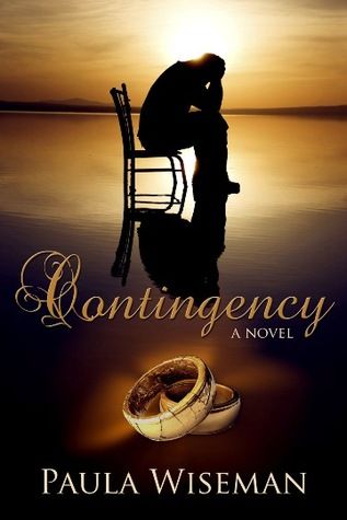
I think this cover excellently portrays the story of the book. The book is about a husband and wife trying to mend their family after the husband has an affair. I love how the cover not only shows the man being remorseful but also shows that their marriage is suffering because of the husband, since his is the band that is cracked and breaking.
 |
| Review |
I love how the cover of this looks like a Currier and Ives Christmas card. A perfect cover for a very sweet story.
 |
| Review |
Even though this story wasn't a favorite, I still love this cover so much! The lighting is great and I love the buildings in the background.


I love all the covers of the Irish Brides trilogy. It's so nice how these covers all look as if they could be a specific scene in the book. I also loved how each had a ship on it, as that played a huge role in the overall story.
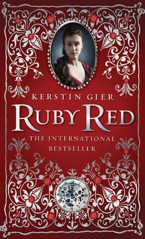
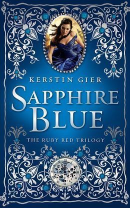
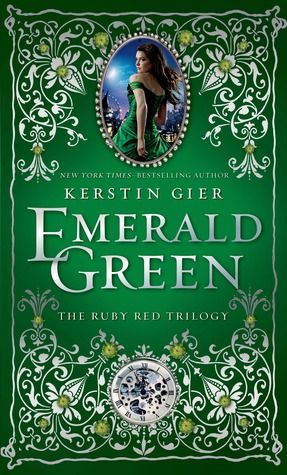
I just love the covers for The Ruby Red trilogy. They just look so beautiful and when you are actually holding them you see all the exquisite detail. The stories are also great! :)
Here are the covers I dislike/hate:
 |
| Review |
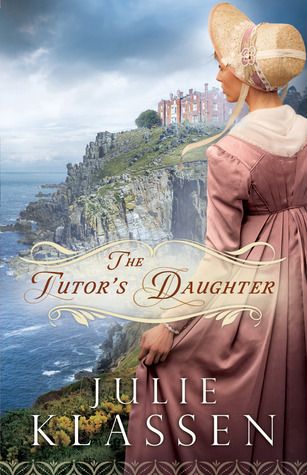
I actually really like this cover, think it's beautiful, but the only reason I slightly dislike it is that the model isn't wearing gloves. The book mentioned a few times how the main character always wore both a hat and gloves when going outside and the only time she didn't wear gloves was when she also wasn't wearing her hat. So that's the only reason I putting it on this list.
 |
| Review |
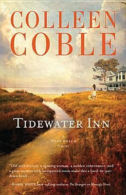
I think this cover is kind of dull and not that interesting, but it's not terrible and is slightly pretty in an old world way - so if the book were historical I would like it more. The only reason I picked it up to read is because I read and enjoyed books by this author in the past. This cover also has a big discrepancy between the inn on the cover and the actual inn. In the book, the inn is a Georgian mansion with over 2,000 sq. ft of decks and balconies alone! Yet the cover shows a house that looks very much like a Victorian and doesn't seem anywhere near the size of the house in the story, which sounds huge as it has 15 bedroom suites.

I don't like this cover at all. The large writing over the person's face is just ugly in my opinion. I wouldn't have read this book if I hadn't needed an X book to complete a challenge, which would have been a shame as I ended up really enjoying the story.
 |
| Review |
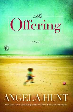
The story for this book is very touching, but this cover is not that good. I don't like the blurry picture of the child and the rest of the cover is pretty boring.
 |
| Review |
I don't really know why I don't like this cover, but I just don't.


The first book in this series was all right, I didn't really like it but it sort of fit the story, but the other two I think are terrible. I don't like the models or the lines and circles, it just is really boring.
PROGRESS SO FAR
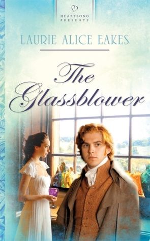
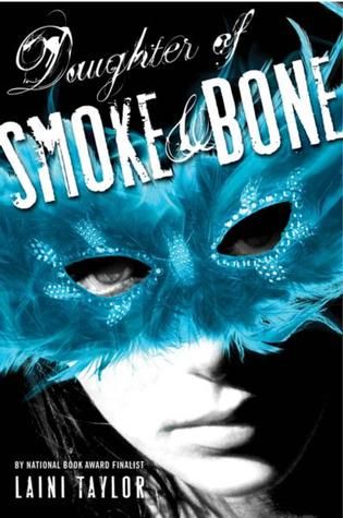
I haven't read much at all since my last update. I started The Glassblower by Laurie Alice Eakes, read about 10 pages, and read a few more pages of Daughter of Smoke & Bone (Daughter of Smoke and Bone, #1) by Laini Taylor. So not much at all! Hoping to get a lot more read this weekend.
- Pages read: 131
- Books finished: 1

Hi, Megan!
ReplyDeleteHey, you sure have an impressive collection of covers here! I agree with your opinion on all of them! However, in spite of the nice cover for "Contingency", I'd never read this book because of the subject matter. I totally dislike reading about infidelity.
The covers for the "Ruby Red" trilogy are absolutely STUNNING. I wish I had included this series in my own post, since I love these covers!! I have to get these books, too!
I, too, think that the covers for the second and third book in The Chemical Garden trilogy are pretty bad. In my opinion, the cover images should have been painted, not photographed. They would have matched the cover of the first book, as well.
The cover of the Judith Karr novel is just HORRENDOUS. it would be nice if the publisher decided to change it!
Thanks for sharing!! : )
I get that, it's definitely a subject that you have to want to read, but know that it is very well done and never justifies the affair.
DeleteThe covers are definitely what drew me to these books, but what made me read them was that they're about time-travel - LOVE books about time-travel!
Ooh, painted would have been cool!
That would be SO nice, maybe they will.
Thanks for commenting, Maria :)
Ooh lots of lovely covers you have here!!!
ReplyDeleteThe Ruby Red trilogy has caught my attention. I really love gem colors so these would be perfect to buy and at to my collection. Oh yeah...they'll be great to read too ;)
I am absolutely loving the cover for Contingency. I love the darks and brights. They really show the mood and meaning of the story. This one is going on my list.
I like your explanations for your "hate it" books, especially that of The Tutor's Daughter. This one made me giggle because it really shows what a die-hard reader you are. I have come to dislike certain covers because it does not fully portray the characters, or simply gets it wrong. For example the cover for Passion by Lisa Valdez is pretty but I was irked that the female was brunette instead of blond. So I completely relate and understand how you feel.
I can see wanting a book just because the cover is pretty to view, I haven't done that yet but I could see myself doing it - LOL! I very much loved reading The Ruby Red trilogy, so if you decide to read them I hope you love them just as much...if not more. :)
DeleteThe story was AMAZING! This was the author's debut novel, but had I not know that I never would have guessed - it's that good!
Yes I am. I annoy myself sometimes, but when a cover doesn't match it just grates on my nerves. It doesn't affect my rating of the book, but I almost always bring it up in my review so that others know and maybe, just maybe, the publisher will see it and try to make sure future books match better. I'm so glad that you can relate! I especially hate it when they get the hair color wrong - don't they get a list of character traits when they go to do the cover? You'd think it would be so easy to get that right. I could see the facial features being different, but hair color? That's just laziness, in my opinion.
Thanks so much for commenting, Vonnie!