Today's challenge is to post book covers that you love and hate, explaining why.
Here are the covers I love:
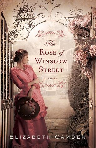
This is one of my favorite covers, if not my absolute favorite. I love every thing about it (the colors, the flowers, the dress, that it matches the story). Not only is the front beautiful, but the back cover is gorgeous with items from the book on it and that makes it even more wonderful after you read it.
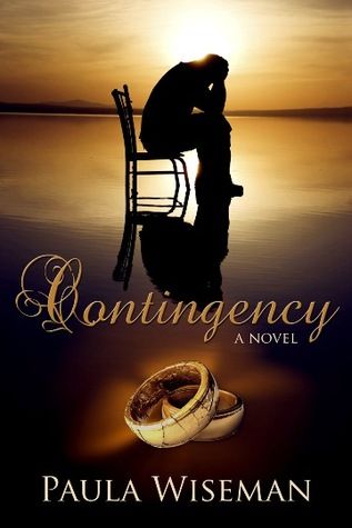
I think this cover excellently portrays the story of the book. The book is about a husband and wife trying to mend their family after the husband has an affair. I love how the cover not only shows the man being remorseful but also shows that their marriage is suffering because of the husband, since his is the band that is cracked and breaking.
I love how the cover of this looks like a Currier and Ives Christmas card. A perfect cover for a very sweet story.
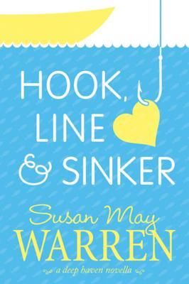
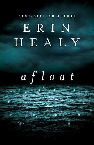
Even though this story wasn't a favorite, I still love this cover so much! The lighting is great and I love the buildings in the background.
I love all the covers of the Irish Brides trilogy. It's so nice how these covers all look as if they could be a specific scene in the book. I also loved how each had a ship on it, as that played a huge role in the overall story.
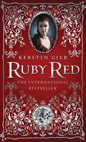
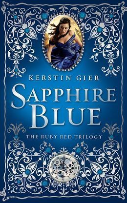
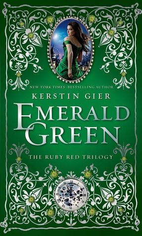
I just love the covers for The Ruby Red trilogy. They just look so beautiful and when you are actually holding them you see all the exquisite detail. The stories are also great! :)
Here are the covers I dislike/hate:
I actually really like this cover, think it's beautiful, but the only reason I slightly dislike it is that the model isn't wearing gloves. The book mentioned a few times how the main character always wore both a hat and gloves when going outside and the only time she didn't wear gloves was when she also wasn't wearing her hat. So that's the only reason I putting it on this list.
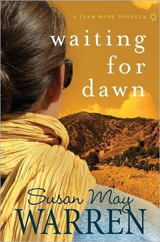
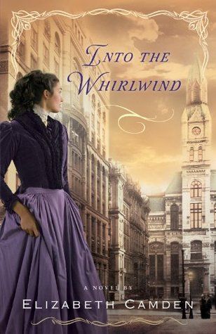
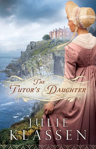
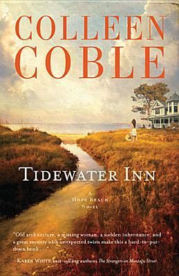
I think this cover is kind of dull and not that interesting, but it's not terrible and is slightly pretty in an old world way - so if the book were historical I would like it more. The only reason I picked it up to read is because I read and enjoyed books by this author in the past. This cover also has a big discrepancy between the inn on the cover and the actual inn. In the book, the inn is a Georgian mansion with over 2,000 sq. ft of decks and balconies alone! Yet the cover shows a house that looks very much like a Victorian and doesn't seem anywhere near the size of the house in the story, which sounds huge as it has 15 bedroom suites.
I don't like this cover at all. The large writing over the person's face is just ugly in my opinion. I wouldn't have read this book if I hadn't needed an X book to complete a challenge, which would have been a shame as I ended up really enjoying the story.
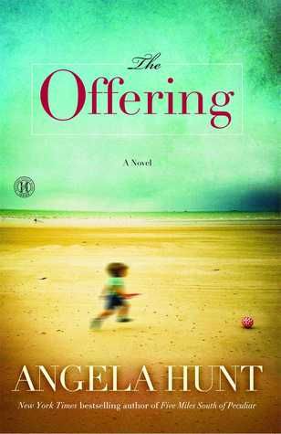
The story for this book is very touching, but this cover is not that good. I don't like the blurry picture of the child and the rest of the cover is pretty boring.
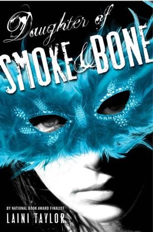
I don't really know why I don't like this cover, but I just don't.
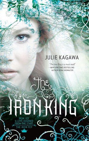
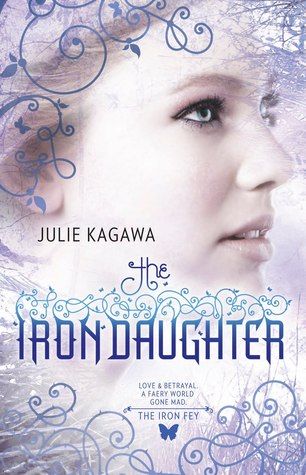
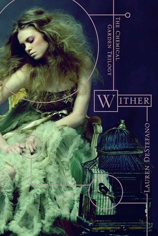
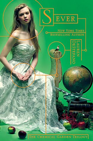
The first book in this series was all right, I didn't really like it but it sort of fit the story, but the other two I think are terrible. I don't like the models or the lines and circles, it just is really boring.
PROGRESS SO FAR